If I’ve said it once, I’ve said it a thousand times. Forgive me for flogging the dead horse here, but I can’t stress this point enough – the mobile future is now.
As smartphone and tablet adoption rapidly increases, so does the importance of mobile-friendly websites. Mobile web access is one of the dominating trends of the internet economy, and marketers who care about better campaign results are quickly turning to responsive design.
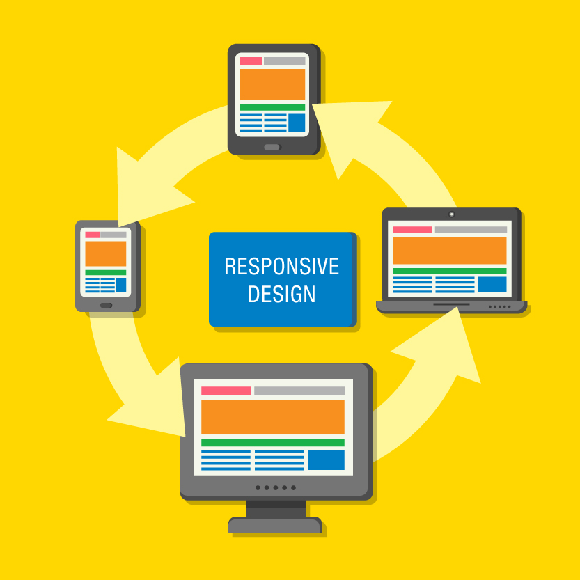
Responsive design allows your webpage to open and function properly no matter what device it is viewed on – whether that is desktop, smartphone or tablet – and is essential if you want your customers to be able to do business with you on the go. If you are trying to decide whether or not to design a new website using responsive design, check out the list below for five reason why responsive design is beneficial for your business.
1. Better UX
One of the most appealing aspects of responsive design is that a responsive website can provide a great user-experience across many devices and screen sizes. A site that works well regardless of these variables will provide a better and more consistent user-experience across the board.
2. It’s Google Recommended
With 67% search market share, when Google talks, marketers listen. And Google states that responsive design is its recommended mobile configuration, and goes so far as to refer to it as an industry best practice. Responsive designs have one URL and the same HTML, regardless of device, which makes it much easier for Google to crawl, index and organise your content. It also makes it easier for users to share, link and interact with content. For example, I share a piece of content I like from my smartphone, but the person I’ve shared it with views it on their desktop. If the site is responsive, they will have the same positive user-experience as I did, but if not, they’re going to end up looking at a stripped down mobile site on their desktop. And as Google is putting more and more emphasis on UX in their rankings, a positive viewing experience is essential for your SEO.
3. Easier to Manage
Having separate desktop and mobile sites means you will have multiple versions that you, or someone else, will have to manage. That’s multiple updates for multiple versions and an SEO campaign for each one. Designing one site that is responsive means you can make edits for all versions of the website in one go.
Responsive design may be expensive initially, but once the design is created, only one update will need to be done when make changes, making it more cost-efficient in the long run.
4. Boosts SEO
Using responsive design will help boost your SEO as it ensures you don’t split clicks across multiple websites. Plus, Google doesn’t take kindly to websites that have content duplicated in multiple places, and may drop you in its SEO rankings, making it less likely to appear on the first page of search engine results.
5. Pay-per-click Benefits
Google AdWords has now converted the web to “enhance campagins.” This means that the targeting of devices is the same, no matter the device. A responsively designed website can use the same landing page for tablets as they do for non-mobile versions, which makes it far, far easier to manage your PPC.
So as customers increasingly use their mobile devices to shop, search and connect, responsive design will ensure user experience is optimised no matter what device your website is being accessed from. It is easier to manage, enhances your SEO and is recommended by the omnipotent Google. If you haven’t joined the mobile revolution, it’s time – all your customers have.
*It’s important to note, there may be situations where responsive design does not suit the particular needs of your customers. For instance, banks use mobile dedicated sites to make mobile banking simpler and more straightforward.