While Google has long favoured websites optimised for mobile, their newest, highly-publicisied change – affectionately dubbed “Mobilegeddon” – means that mobile-friendliness is officially a huge factor in search rankings.
The number of people using mobile devices to access the web is increasing rapidly, and Google’s new algorithm will reflect that growing trend, favouring sites with large text, easily clickable links and optimised sizes that fit smaller screens – sites that don’t comply will be demoted in the rankings.
So while the need to engage the mobile user is obvious, the question remains – what’s the optimal way to do it: a dedicated mobile site or responsive web design?
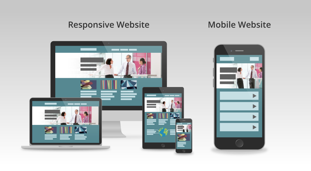
Option 1: Responsive web design (RWD)
A “responsive” design is built to accommodate all aspects of a mobile visitor experience, regardless of what kind of device you are using. In theory, these sites will work just as well on an iPhone as they do on a desktop, giving users access to the full content of a site no matter how they choose to access it. Responsively designed sites are flexible and fluid, resizing and reformatting content based on the screen it is being viewed on.
The underlying assumption with a responsive site is that the user wants all of the information on the primary site available on any device.
Option 2: Dedicated mobile site
In contrast to RWD, a mobile-only site is a stripped-down version of the main site, with less content and an emphasis on contact methods rather than a complete website experience. When a user accesses your site from a mobile device, it is automatically directed to the mobile version.
Mobile-only sites are usually predicated upon the user having visited the main site first and simply wanting to check the status of an order or verify an appointment/reservation – meaning portability and efficiency trump full access.
Building a new website is costly, so naturally you want to get the greatest ROI from your site scheme; however you decide to set it up. Both options have their pros and cons, a responsive build typically costs more upfront as it has to be built to interact with different devices using different operating systems, which usually means it needs to be customised. However, RWD only requires one set of code, so after it’s built, the only real maintenance is keeping your content updated.
Building a regular website and a mobile website independent of one another creates a different hassle. Building a mobile-only site can be less costly to build but can double in cost in the long run as you will need to maintain and update multiple sets of code.
Determining which option will work best for you and your business is to ask yourself which of these assumptions your site is based on – is your audience after full access to all of your content, or quick and straightforward contact options and navigation?
A mobile website can be a good choice for a site dedicated to consumer goods, whereas responsive design would be better for a complete inventory plus thought provoking articles and insights.
BallantyneTaylor has experience building both fully responsive websites as well as mobile-only ones. If you’d like to know more, email Steve Ballantyne at steve@b2bpartners.nz